Visualization
import numpy as np
import pandas as pd
from sklearn.cross_validation import train_test_split
from sklearn.linear_model import LogisticRegression
from sklearn.metrics import roc_curve, auc
import matplotlib as mpl
import matplotlib.cm as cm
import matplotlib.pyplot as plt
import pandas as pd
pd.set_option('display.width', 500)
pd.set_option('display.max_columns', 100)
pd.set_option('display.notebook_repr_html', True)
import seaborn as sns
sns.set_style("whitegrid")
sns.set_context("poster")
from matplotlib.colors import ListedColormap
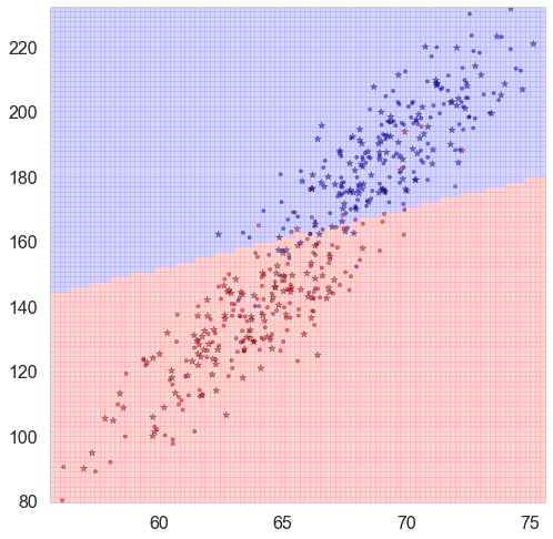
Binary Classification results based on two features
cmap_light = ListedColormap(['#FFAAAA', '#AAFFAA', '#AAAAFF'])
cmap_bold = ListedColormap(['#FF0000', '#00FF00', '#0000FF'])
def classify_plot(ax, Xtr, Xte, ytr, yte, clf, mesh=True, colorscale=cmap_light, cdiscrete=cmap_bold, alpha=0.1, psize=10):
    h = .02
    X=np.concatenate((Xtr, Xte))
    x_min, x_max = X[:, 0].min() - .5, X[:, 0].max() + .5
    y_min, y_max = X[:, 1].min() - .5, X[:, 1].max() + .5
    xx, yy = np.meshgrid(np.linspace(x_min, x_max, 100),
                         np.linspace(y_min, y_max, 100))
    Z = clf.predict(np.c_[xx.ravel(), yy.ravel()])
    ZZ = Z.reshape(xx.shape)
    if mesh:
        plt.pcolormesh(xx, yy, ZZ, cmap = colorscale, alpha=alpha, axes=ax)
    else:
        showtr = ytr
        showte = yte
    ax.scatter(Xtr.iloc[:, 0], Xtr.iloc[:, 1], c=showtr-1, cmap=cdiscrete, s=psize, alpha=alpha, edgecolor="k")
    # and testing points
    ax.scatter(Xte.iloc[:, 0], Xte.iloc[:, 1], c=showte-1, cmap=cdiscrete, alpha=alpha, marker="*", s=psize+30)
    ax.set_xlim(xx.min(), xx.max())
    ax.set_ylim(yy.min(), yy.max())
    return ax,xx,yy
Parameters
-
ax: figure information -
Xtr: pandas.DataFrameTraining set of features where features are in the columns
-
Xte: DataFrameTesting set of features where features are in the columns
-
ytr: DataFrameTraining set of target
-
yte: DataFrameTesting set of target
-
clf: fitted classifier -
mesh: plot mesh or not. IfFalse, then it only plots predicted values. -
colorscale: specify theColormapfor mesh plotColormapis the base classes to convert numbers to color to the RGBA color. -
cdiscrete: specify theColormapfor points -
alpha: transparency -
psize: size of points
Returns
-
ax:figure information -
xx: x axis coordinates -
yy: y axis coordinates
Demo:
dfhw=pd.read_csv("https://dl.dropboxusercontent.com/u/75194/stats/data/01_heights_weights_genders.csv")
df=dfhw.sample(500, replace=False)
df.Gender = (df.Gender=="Male") * 1
X_train, X_test, y_train, y_test = train_test_split(
    df[['Height', 'Weight']], df.Gender, test_size=0.4, random_state=42)

clflog = LogisticRegression()
clf = clflog.fit(X_train, y_train)
plt.figure(figsize = (15,13))
ax=plt.gca()
classify_plot(ax, X_train, X_test, y_train, y_test, clf, alpha = 0.5)
plt.show()
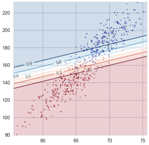
Probability boundaries
cm = plt.cm.RdBu
def classify_plot_prob(ax, Xtr, Xte, ytr, yte, clf, colorscale=cmap_light, cdiscrete=cmap_bold, ccolor=cm, psize=10, alpha=0.1, prob=True):
    ax,xx,yy = points_plot(ax, Xtr, Xte, ytr, yte, clf, mesh=False, colorscale=colorscale, cdiscrete=cdiscrete, psize=psize, alpha=alpha)
    if prob:
        Z = clf.predict_proba(np.c_[xx.ravel(), yy.ravel()])[:, 1]
    else:
        Z = clf.decision_function(np.c_[xx.ravel(), yy.ravel()])
    Z = Z.reshape(xx.shape)
    plt.contourf(xx, yy, Z, cmap=ccolor, alpha=.2, axes=ax)
    cs2 = plt.contour(xx, yy, Z, cmap=ccolor, alpha=.6, axes=ax)
    plt.clabel(cs2, fmt = '%2.1f', colors = 'k', fontsize=14, axes=ax)
    return ax
Parameters
-
ccolor: specify theColormapfor contour plot -
prob: use probability or decision function
Demo:
plt.figure(figsize = (15,13))
ax=plt.gca()
classify_plot_prob(ax, X_train, X_test, y_train, y_test, clf, alpha = 0.5)
plt.show()
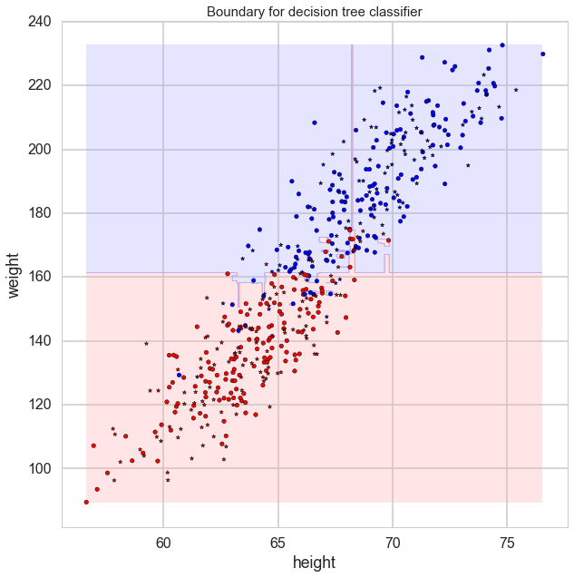
Tree Classifier plot
def plot_tree(ax, Xtr, Xte, ytr, yte, clf, plot_train = True, plot_test = True, lab = ['Feature 1', 'Feature 2'],
               mesh=True, colorscale=cmap_light, cdiscrete=cmap_bold, alpha=0.3, psize=10):
    # Create a meshgrid as our test data
    plt.figure(figsize=(15,10))
    plot_step= 0.05
    xmin, xmax= Xtr[:,0].min(), Xtr[:,0].max()
    ymin, ymax= Xtr[:,1].min(), Xtr[:,1].max()
    xx, yy = np.meshgrid(np.arange(xmin, xmax, plot_step), np.arange(ymin, ymax, plot_step) )

    # Re-cast every coordinate in the meshgrid as a 2D point
    Xplot= np.c_[xx.ravel(), yy.ravel()]
    # Predict the class
    Z = clf.predict( Xplot )

    # Re-shape the results
    Z= Z.reshape( xx.shape )
    cs = ax.contourf(xx, yy, Z, cmap= cmap_light, alpha=0.3)

    # Overlay training samples
    if (plot_train == True):
        ax.scatter(Xtr[:, 0], Xtr[:, 1], c=ytr-1, cmap=cmap_bold, alpha=alpha,edgecolor="k")
    # and testing points
    if (plot_test == True):
        ax.scatter(Xte[:, 0], Xte[:, 1], c=yte-1, cmap=cmap_bold, alpha=alpha, marker="*")

    ax.set_xlabel(lab[0])
    ax.set_ylabel(lab[1])
    ax.set_title("Boundary for decision tree classifier",fontsize=15)
Demo
from sklearn.ensemble import RandomForestClassifier
rf = RandomForestClassifier()
rf.fit(X_train, y_train)
plt.figure(figsize = (10,10))
ax=plt.gca()
plot_tree(ax, np.array(X_train), np.array(X_test), np.array(y_train), np.array(y_test),
           clf = rf, lab = ['height', 'weight'], alpha = 1)
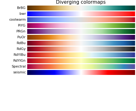
Colormaps
Colormaps is very useful when we try to convert numbers into colors.
If the colormaps have a listed values like ListedColormap(['#FFAAAA', '#AAFFAA', '#AAAAFF']), it means to map one number into one of these three colors. For example if \(X = [x_1, … , x_n]\) has values from 0 to 1, then [0, 0.33] indicates color #FFAAAA, (0.33, 0.66] indicates color #AAFFAA and (0.66, 1] indicates color AAAAFF.
If the colormaps is continuous like plt.cm.RdBu, then the numbers should map to that range. The following is one example:
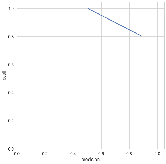
Precision vs. Recall
def pr_curve(truthvec, scorevec, digit_prec=2):
    threshvec = np.unique(np.round(scorevec,digit_prec))
    numthresh = len(threshvec)
    tpvec = np.zeros(numthresh)
    fpvec = np.zeros(numthresh)
    fnvec = np.zeros(numthresh)

    for i in range(numthresh):
        thresh = threshvec[i]
        tpvec[i] = sum(truthvec[scorevec>=thresh])
        fpvec[i] = sum(1-truthvec[scorevec>=thresh])
        fnvec[i] = sum(truthvec[scorevec<thresh])
    recallvec = tpvec/(tpvec + fnvec)
    precisionvec = tpvec/(tpvec + fpvec)
    plt.plot(precisionvec,recallvec)
    plt.axis([0, 1, 0, 1])
    plt.xlabel('precision')
    plt.ylabel('recall')
    return (recallvec, precisionvec, threshvec)
Demo
rf = RandomForestClassifier()
rf.fit(X_train, y_train)
y_pred = rf.predict(X_test)
plt.figure(figsize = (10,10))
pr_curve(y_test, y_pred)
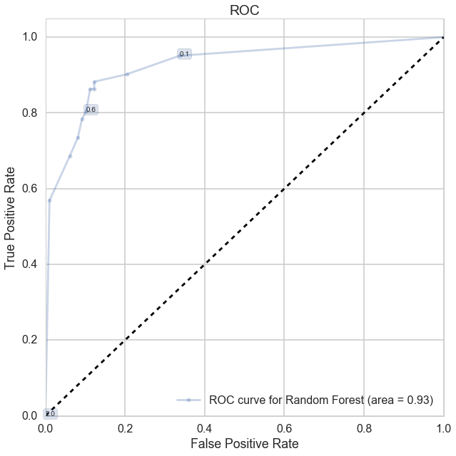
ROC Curve
This function can present the thresholds in the ROC figure.
def make_roc(name, clf, ytest, xtest, ax=None, labe=5, proba=True, skip=0):
    initial=False
    if not ax:
        ax=plt.gca()
        initial=True
    if proba:
        fpr, tpr, thresholds=roc_curve(ytest, clf.predict_proba(xtest)[:,1])
    else:
        fpr, tpr, thresholds=roc_curve(ytest, clf.decision_function(xtest))
    roc_auc = auc(fpr, tpr)
    if skip:
        l=fpr.shape[0]
        ax.plot(fpr[0:l:skip], tpr[0:l:skip], '.-', alpha=0.3, label='ROC curve for %s (area = %0.2f)' % (name, roc_auc))
    else:
        ax.plot(fpr, tpr, '.-', alpha=0.3, label='ROC curve for %s (area = %0.2f)' % (name, roc_auc))
    label_kwargs = {}
    label_kwargs['bbox'] = dict(
        boxstyle='round,pad=0.3', alpha=0.2,
    )
    for k in range(0, fpr.shape[0],labe):
        #from https://gist.github.com/podshumok/c1d1c9394335d86255b8
        threshold = str(np.round(thresholds[k], 2))
        ax.annotate(threshold, (fpr[k], tpr[k]), **label_kwargs)
    if initial:
        ax.plot([0, 1], [0, 1], 'k--')
        ax.set_xlim([0.0, 1.0])
        ax.set_ylim([0.0, 1.05])
        ax.set_xlabel('False Positive Rate')
        ax.set_ylabel('True Positive Rate')
        ax.set_title('ROC')
    ax.legend(loc="lower right")
    print('AUC: ', roc_auc)
    return ax
Parameters
-
name: string, indicating the name of model -
clf: fitted classifier -
labe: the distance between two adjacent labels. -
proba: some classifiers, like KNN, Logistic regression, need to setproba = True -
skip: the step size when plot ROC
Demo
plt.figure(figsize = (10,10))
make_roc('Random Forest', rf, y_test, X_test)
plt.show()
Remarks
- The first two functions are only for logistic regression, KNN, SVM and Random Forest.
- When you try to feed SVM into
classify_plot_prob, you need to setprobability = TrueinSVC(). - The second function may present ugly figures for KNN and Random Forest.